Improving Wishpond’s Editors Drag & Drop Experience
UX/UI, User Research, Usability Testing
In 2018 as the UX/UI Lead for this project, I helped the team improve the drag & drop editor experience to make moving and editing page elements simple and intuitive.

My Role
I lead user experience and interaction design of the Improving Drag & Drop Experience Project. Collaborated with CPO and development team to understand, conceptualize and design a new drag & drop experience. I was responsible for creating research deliverables, prototyping, and the interaction and visual design of the improved editor.
Diving into the problem space
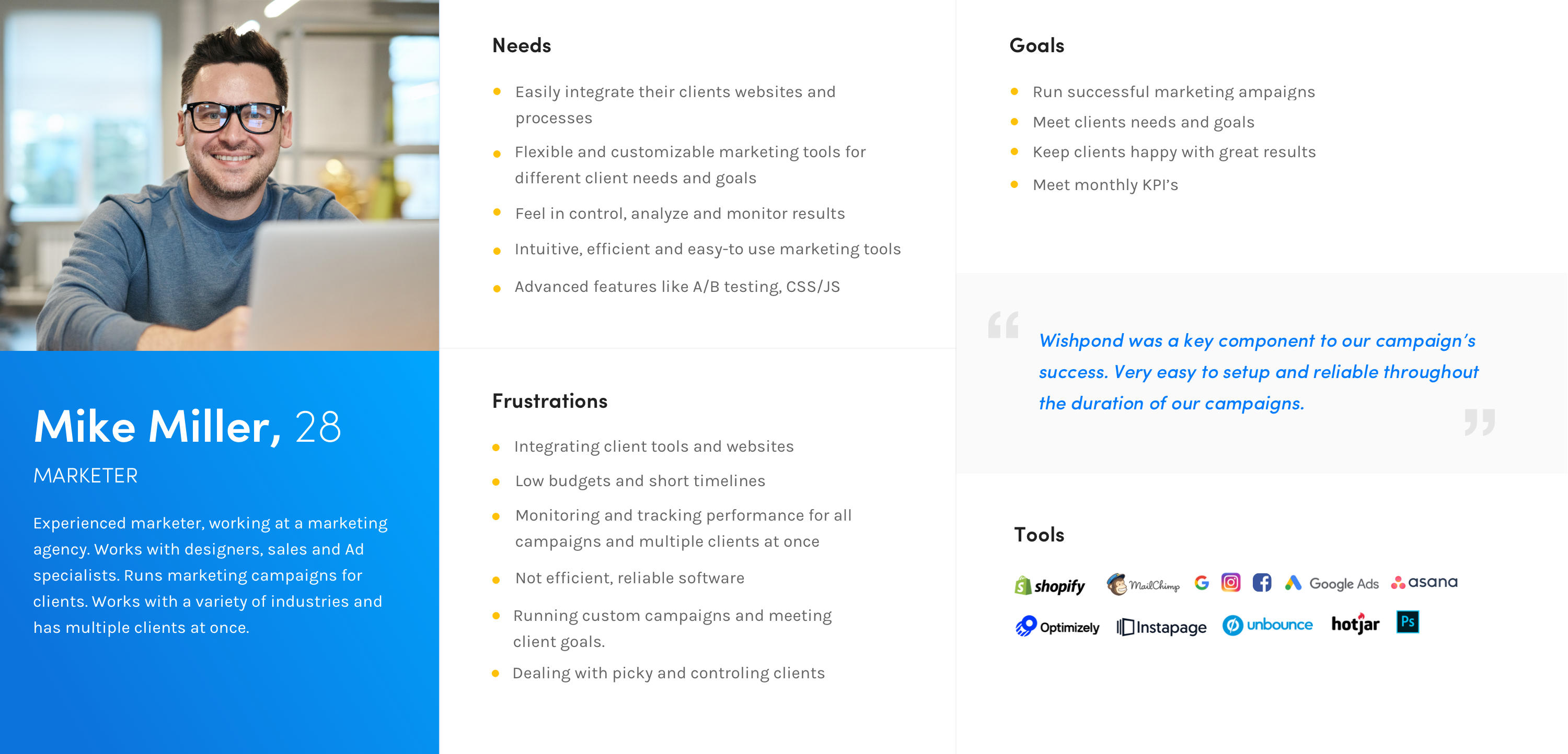
In 2016 we redesigned the UI of the editor and since then have been working hard on making improvements to the experience of the editor. Over the years we have gathered lots of feedback from our customer support team and we interviewed our in house marketing teams and as well as self-serve customers.
This provided lots of great insights, but also revealed one of the biggest problems to be solved. New users were stuggling to figure out how to move and arrange elements on the page and could not figure out how sections, rows and columns work. This lead to great frustration and users couldn’t reach the value factor before the free-trial ends.

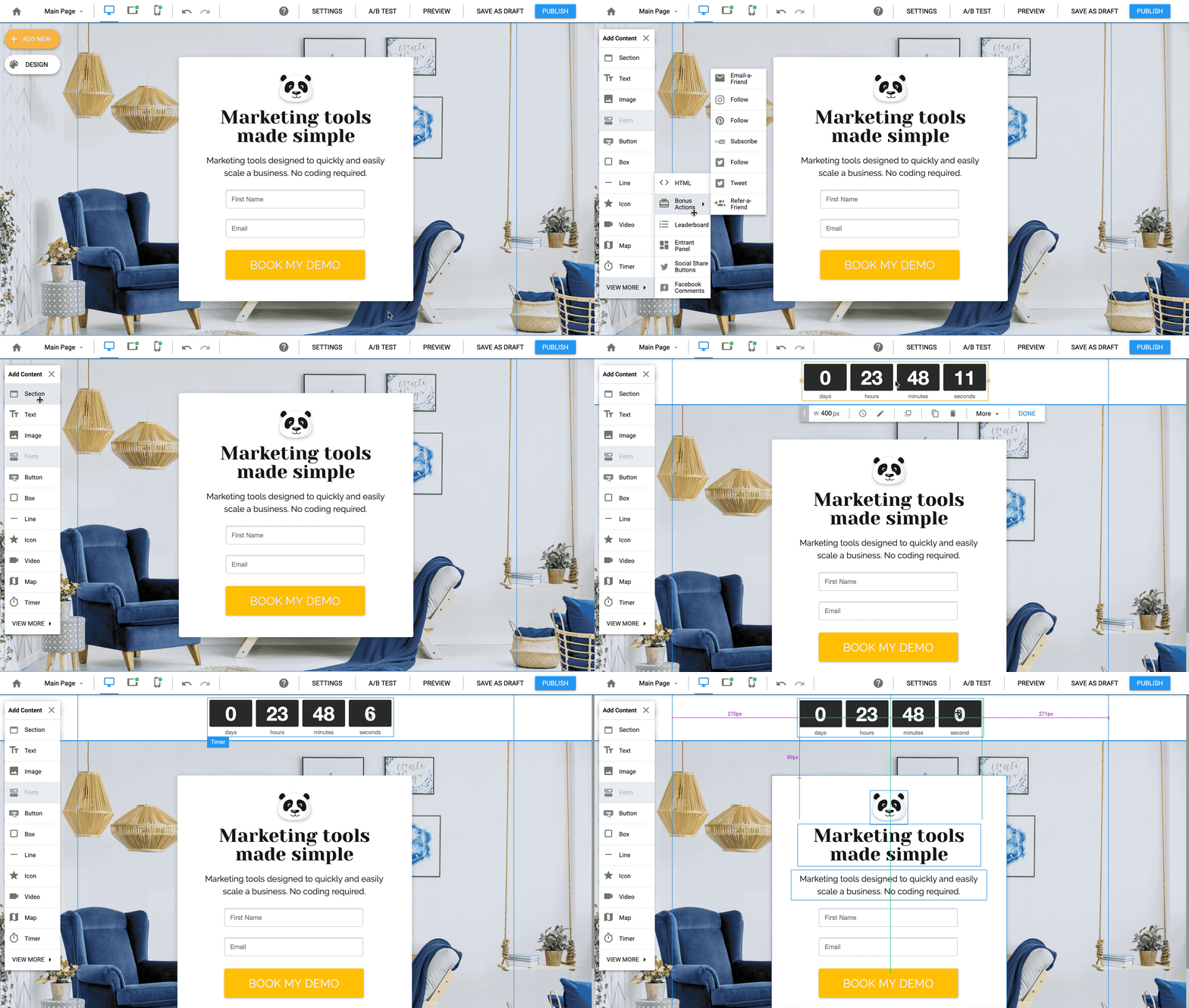
Current editor: Arranging objects in a column
Challenge
- Design an intuitive drag & drop editing experience with an aim at increasing campaign publishing rates and upgrades.
- Help new users create campaigns easily and efficiently.
- Reduce time spent inside the editor so that users can focus on achieving results and growing their business.
Taking a closer look at Campaign Creation
When a marketer or a small business owner signs up for Wishpond, they are looking for a intuitive and easy to use marketing campaign tools. Wishpond’s marketing site promises an inutitive drag & drop builder experience, that requires no technical knowledge and where you can build a high-converting campaign in minutes.
Creating a successful campaign can be very time consuming and can require lots of work, from planning, choosing a template, editing, adding and creating content, setting up links, publishing, driving traffic, A/B testing and so forth. I wanted to improve the usability of the editor to make editing as efficient and simple as possible.


Competitor Comparison
When researching and comparing other drag & drop content editors (like Unbounce, Instapage, Canva, Wix, Keynote), I found that most of them are true drag & drop editors, where users can freely move and arrange objects anywhere they like within the bounds of the page.
I wanted to find out what our users think about other editors on the market so I ran user tests using usertesting.com and internally with our inhouse marketing team, comparing Wishpond's Editor to one of it's main competitors.

[Wishpond's] editor was so frustrating... I hated that the boxes wouldn't just move where I wanted them to. I also never quite figured out the rows and columns.
Research Findings:
- 70% of participants preferred our competitors' editor over Wishpond mainly because they could easily move elements anywhere on the page and the drag-and-drop interactions matched their expectations.
- Participants on average rated Wishpond's editor 2/10 compared to the competitor editor, 7/10
- Not so tech savy participants who had less experience with web editors prefered the true drag & drop format, but our inhouse designers and tech savy marketers prefered Wishpond's editor
Techincal challenges
Making any changes to the existing drag & drop interaction is a big decision and would require our development team to rewrite the entire editor from scratch. This is a massive effort and would take around 6-7 months to develop.
Over the years, we tested out simpler solutions, such as creating an interactive onboarding walkthroughs for and making better templates that require minimal changes. But all of these felt like band-aid solutions and new users continued to struggle with creating campaigns. Finally by the end of 2018, the executive team finally agreed to move forward with this massive project.

What makes a good drag & drop experience?
I started to research more and take a look at other editors in more detail to find what features make a good drag & drop experience.
- Smooth drag & drop micro-interactions
- Smart alignment/size/spacing guides and snapping abilities
- Grouping and arranging multiple objects at once
- A smart way to automatically maintain the layout on Mobile and retain responsiveness.
- Complex objects like forms should automatically re-align and re-arrange themselves automatically when adding/removing components
I presented my research findings along with design solutions to the development team and stakeholders to determine the technical realities and what we can actually implement. After many discussions and iterations, I created a list of feature requirements, detailed user flows, mockups and design specifications that are necessary for the Beta version of the new editor.
Collaboration is key
In order to design this new absolute postioned experience and find edge cases, I collaborated closesly with the CTO and the development team to build and test a working beta version of the editor. Throughout the development process we stumbled upon many new challenges. For example:
- How do users expect the tablet & mobile editor views to work? No other editor has a tablet mode, do we even need to keep the tablet mode?
- What happens to objects when you edit/move them to another section in another view?
- Should the automatic mobile layout assistant be triggered manually or automatically when you switch to mobile view? Do you need an automatic layout assistant on tablet?
Back to the drawing board
I had to go back and do more research to find answers to these questions. I interviewed inhouse marketers to gather feedback and discovered that:
-
Arranging, re-sizing elements and having the option to hide/show certain elements on mobile should only affect the Mobile view.
-
60% of participants expect that adding, deleting and editing content on tablet & mobile should affect all views.
-
We need to keep the tablet mode for Facebook publishing, but only 1% of campaigns are published on Facebook.
-
Marketers mostly focus on creating campaigns for desktop and mobile because our current editor is responsive.

Mobile View: Position and size of elements are device specific

Keep Tablet view optional

Enable Tablet View to publish to Facebook
Beta launch & beyond
Wishpond launched the new beta editor in 2019 & its currently its only available for beta-testers. Since then have continued to optimize and develop new features like keyboard shortcuts, helpful tips for starting out users and further improvements based on feedback. We found that beta users could successfully reach the campaign publishing step. Among beta users campaign publishing rate increased by 30% and they reported to have continued using Wishpond for other campaigns.

Takeaways & lessons learned
- Be on top of what your competitors are doing learn from them.
- Involve your development team as early as possible to catch edge cases and work out technological challenges.
- Facilitate user testing as early as possible to gather insights and to test your ideas.