Wishpond's Marketing
Campaign Editor UI Redesign
Ux/UI Design
Wishpond is a fast growing Vancouver based SAAS company that is on a mission to making online marketing easy for marketers of all skill levels. The platform features a powerful drag and drop editor for creating landing pages, popups, and social promotion contests with no coding required.
About the project
In 2016 Wishpond decided to modernize the drag & drop marketing campaign editor and make it easier for self-service users to create successful campaigns. I had the pleasure of working together with Wishpond's Chief Product Officer to completely redesign the UI of editor while maintaining the same functionality.
My Role
I joined the product team in 2016 as a Junior UX/UI designer and worked together with Nick, Wishpond's Chief Product Officer analyzing, researching, and coming up with ideas. I was responsible for:
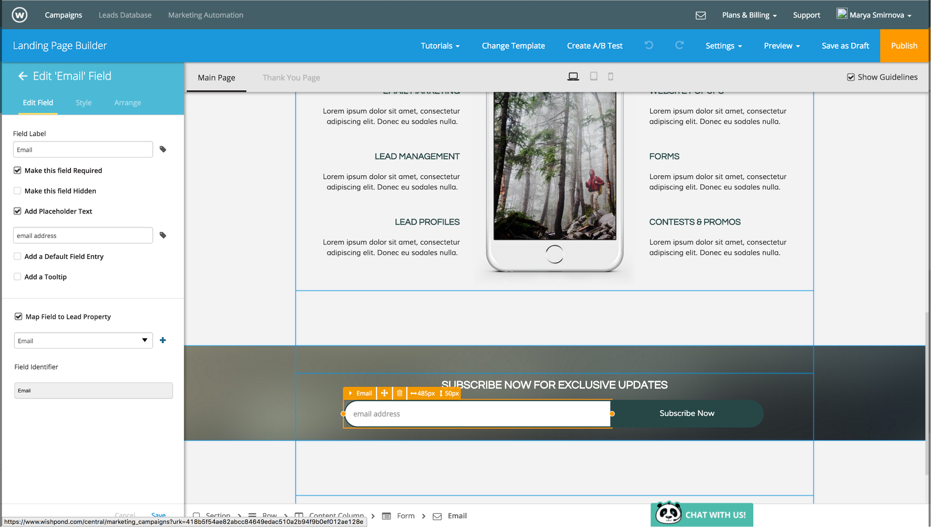
- Interaction design, creating high-fidelity mockups & interface flows
- Creating UI Patterns & preparing designs for dev handoff.
- Working closely with the software development team to conduct feature reviews and make the new UI come to life
- Usability testing and gathering feedback from customers.
Defining the Problem
We started the project by analysing and gathering insights on paint points users are currently experiencing. We gathered feedback from our support team, watched Hotjar screen recordings, and facilitated usability tests. Here are some of our findings:
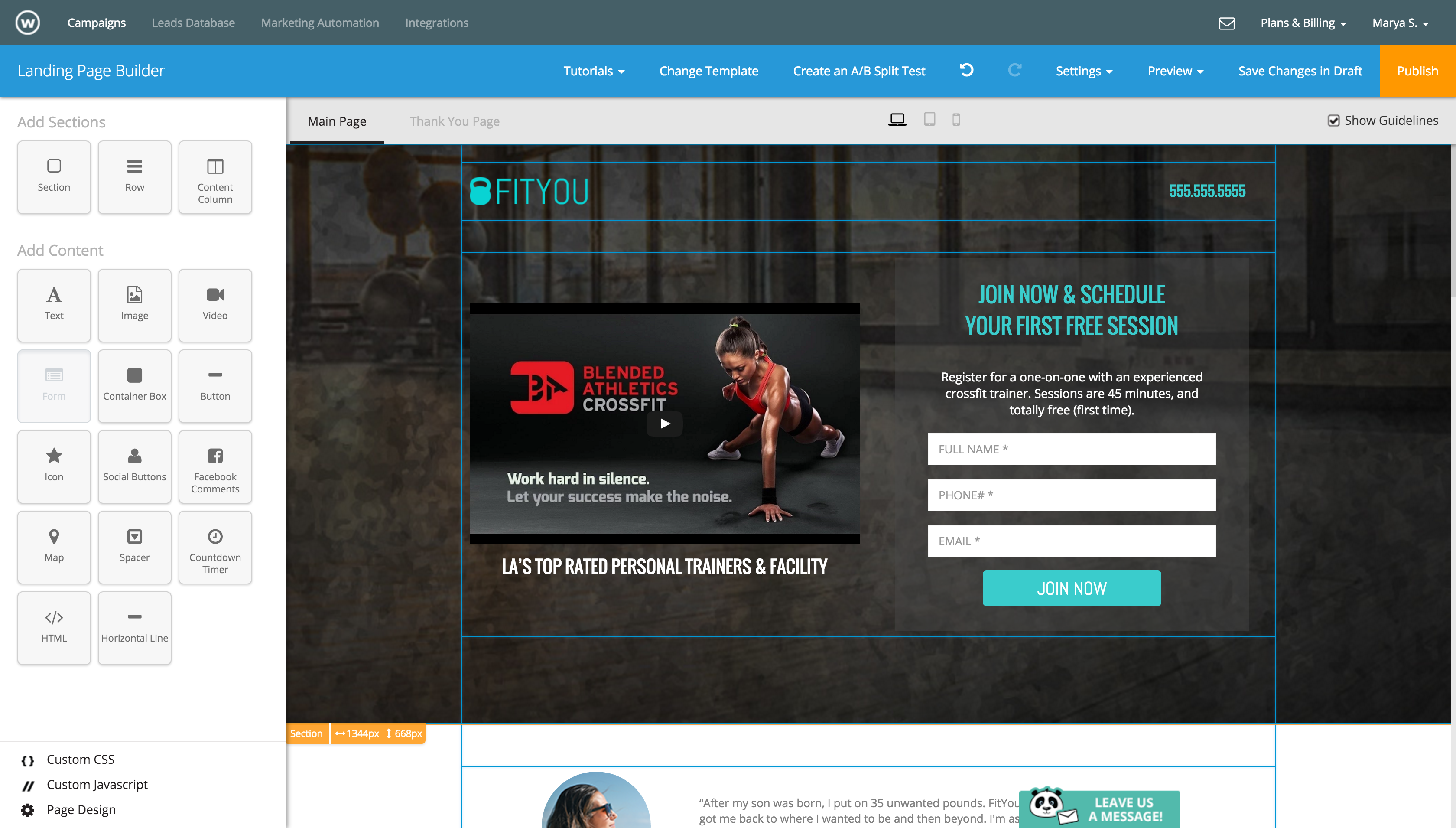
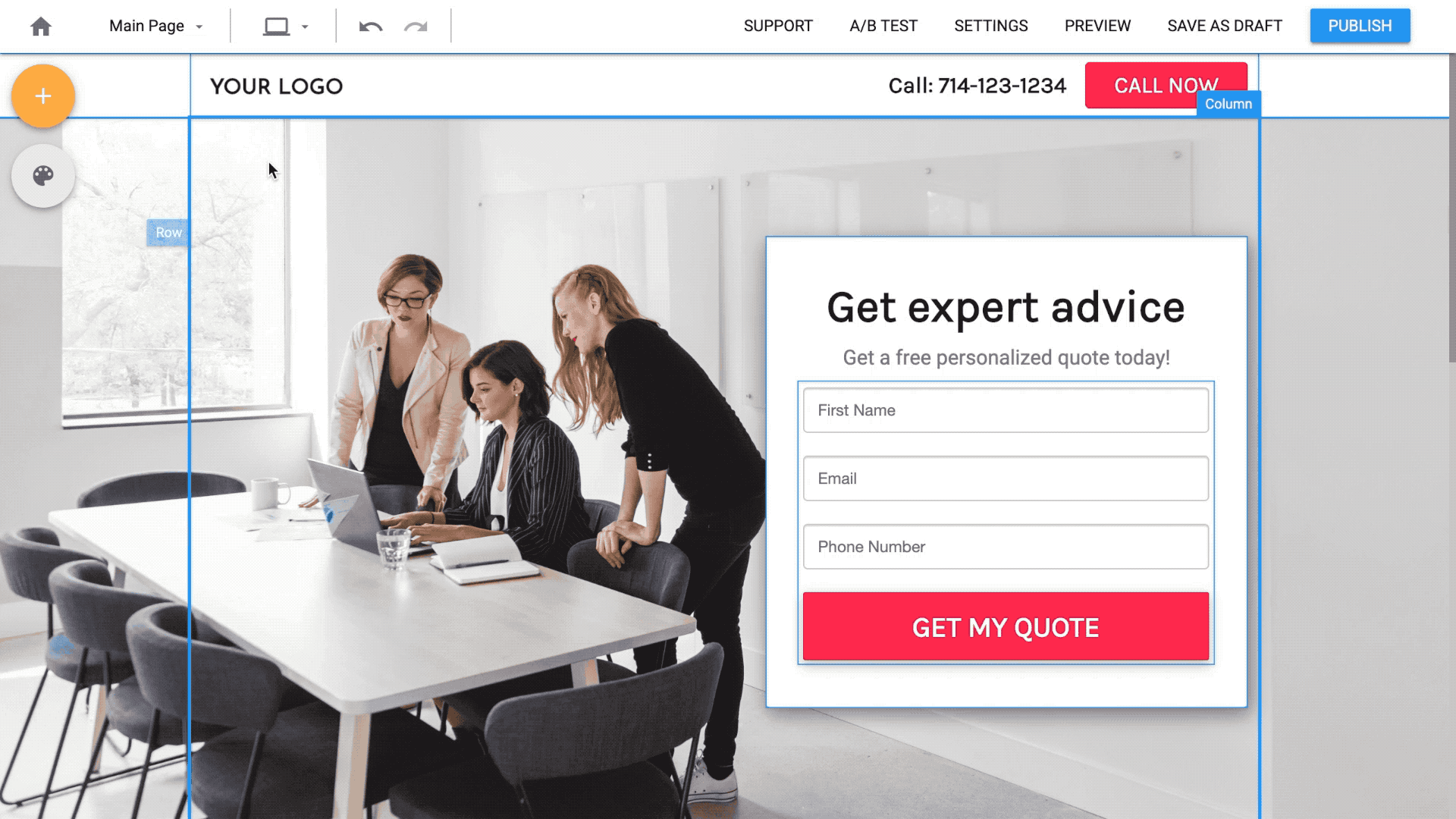
- Editor felt overwhelming & cluttered
There were too many additional options that were presented at once, resulting in a small editing space. The editor also lacked aesthetics and minimal design.
- Lack of efficiency
Editing options appeared in a sliding side panel, and organized by type using tabs. Users would spend one hour or more to create a simple landing page. Templates were also long and complicated. They required lots of design and content changes.
- A steep learning curve to perform essential functions
Starting-out users could not figure out how to use Wishpond's Section/Row/Column page structure or how to move contents within the page. (This is something we could not address in this redesign)
Page objects aligned inside the column instead of just dragging & dropping them to the desired location. Users had to add spacer objects to create space in between objects or add margin and padding.
2016 Marketing Campaign Editor
Initial Explorations
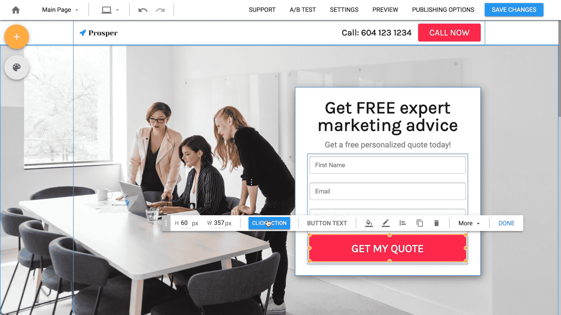
I started by gathering inspiration from popular drag & drop editors on the market, like Canva, Wix, Squarespace, and Instapage. I was also looking for a UI Framework that our development team could use to speed up the process. I chose Material UI for its adaptable system of guidelines, components, and tools that support the best practices of user interface design. It also has most of the globally known icons that we needed inside our editor.

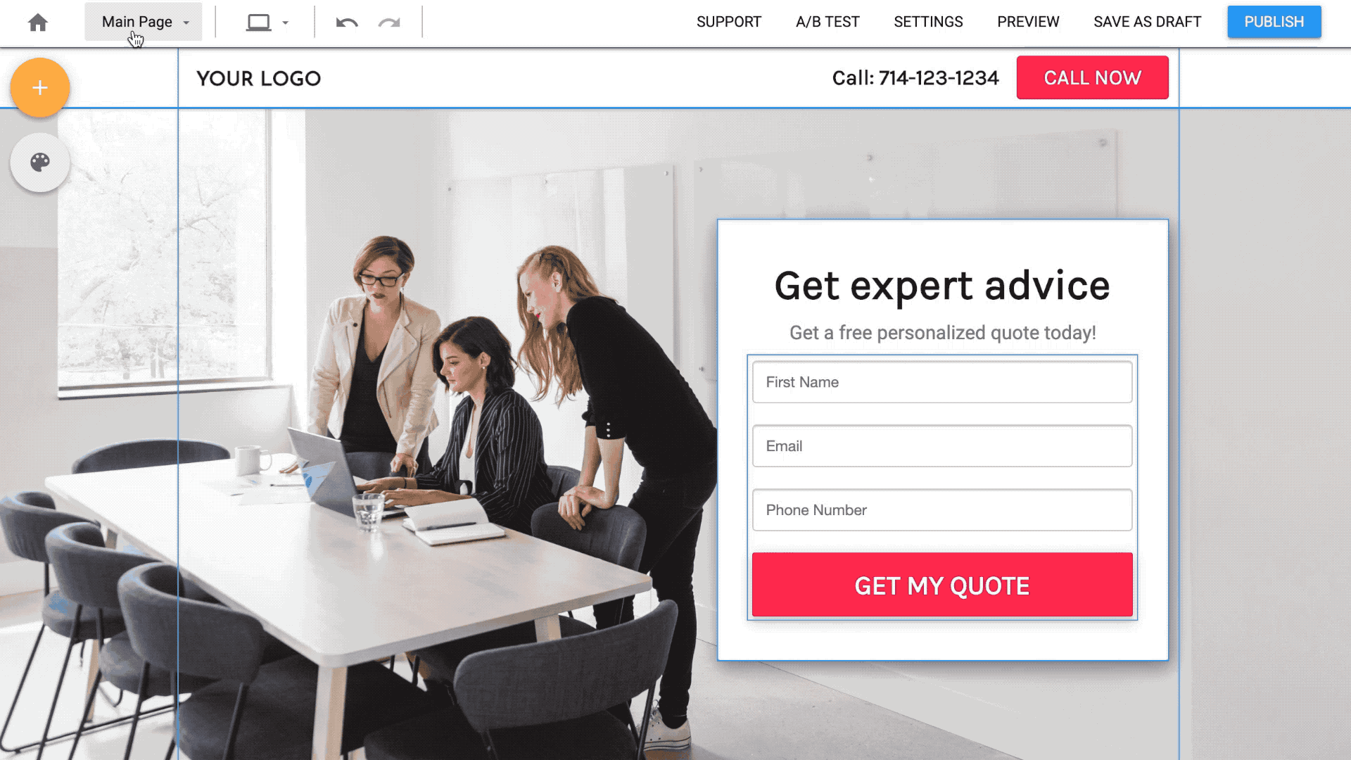
Initial UI exploration on how to edit a button
Design Solutions
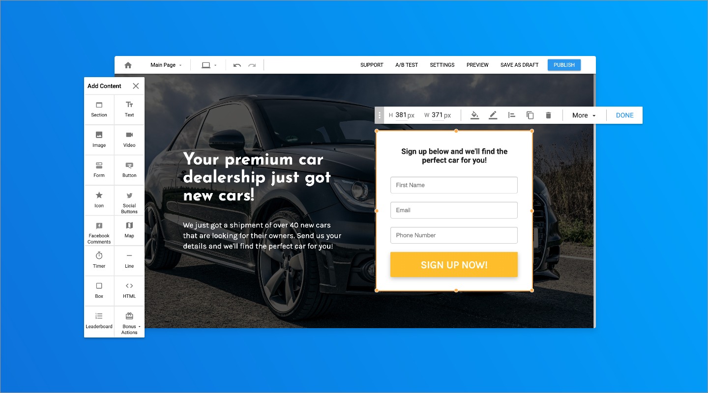
Simplifying Navigation & decluttering the editor
We decided to remove the side panel and remove the main navigation bar, which opened up the editing space and creates focus only on editing. The "Add contents" panel and the page design options are accessible from the side fab buttons at any time.
Instant editing on the spot
We created a toolbar-menu system that simplifies the editing process by only showing the essential editing options. We hid all of the rarely used and more advanced options under “More”. We chose to use icons to make the toolbar as short as possible.
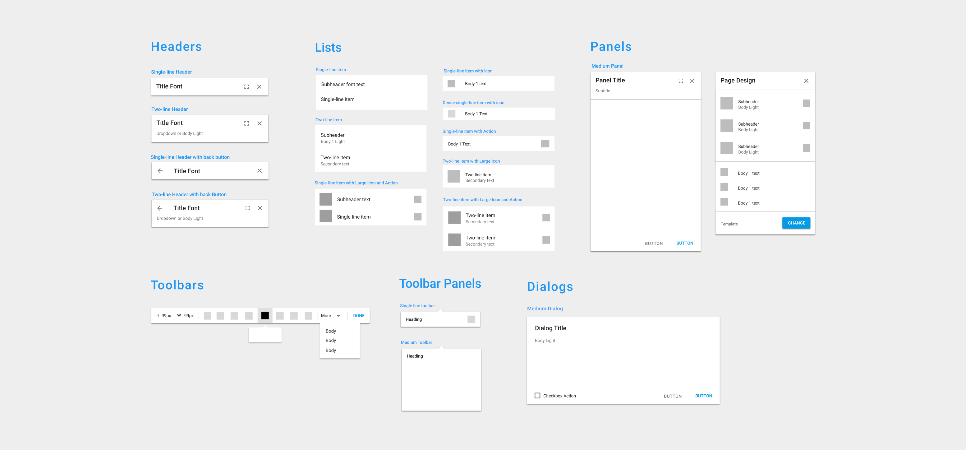
UI Guidelines
Inspired by Material UI, I created UI guidelines for all components inside the editor to ensure consistency for new features.
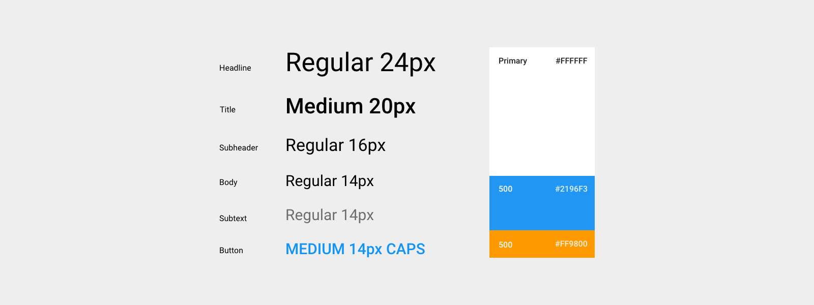
Color & Typography
Building blocks of editor components